
Content Index
- What is a component in Blade?
- Structure and Advantages
- Types of Components in Laravel
- Initial structure
- Anonymous Components: List View
- Component Structure (Blade)
- Layout
- Style Modularization with CSS
- Listed in the component
- Slot
- Default slot
- Slots with name
- How to send it from the view
- Slots with name on a line
- Slots or Props? (Key Differences)
- Using props in Laravel components to set default classes
- The Challenge: Avoid Style Conflicts
- Using Props for Customization
Components are similar to layouts and view fragments in Laravel Blade; but on steroids, since they allow the definition of parameter passing (such as view fragments), slot definition, to place key content, attribute passing, method calls, among other options.
What is a component in Blade?
A component is essentially a reusable piece. The main goal is to avoid monolithic applications and create structures divided into simple blocks.
Practical example in a blog:
Imagine a list of posts. We can divide it like this:
- Item component: The card that displays an individual post.
- Actions component: Within the item, a block for "favorites" or "likes."
- Comments component: A block that, in turn, contains other components for each individual comment.
Structure and Advantages
The central idea of the components is that, with them, we can make true micro applications, meaning with micro applications, small ”components” that perform a particular function, such as listing a post; but, from this list, the same component is capable of providing options on that same component, such as, for example, assign it to a favorite, remove a favorite, add it to a classification, indicate if you want to show it based on a condition and tasks of this type. The fundamental advantage over view fragments is that all of this option logic is inside the component, and doesn’t depend on parent components (as view fragments would).
Types of Components in Laravel
There are two approaches to writing components:
- Class-based components, which consist of a view and a class.
- Anonymous components, which consist of only one view.
To create a component, we can do it through artisan with:
$ php artisan make:component <YourComponente>To which you can indicate the folder hierarchy, and the --view option to indicate that you want a component with only one view.
Or if you're going to put them in folders and it is a component with classes, you absolutely must use the first letter in uppercase (UpperCamelCase) and separate them with /:
$ php artisan make:component Forms/InputThis lesson is mostly practical, since the idea is to introduce some functionalities that have this type of elements based on examples.
Initial structure
In this section, we are interested in building part of the web module for the end user, that is, where we are going to have our post lists to be consumed by an user.
We’re going to use the components in conjunction with a controller, so let’s create that controller with:
$ php artisan make:controller blog/BlogController -m PostAnd it will have the following structure:
app\Http\Controllers\blog\BlogController.php
<?php
namespace App\Http\Controllers\blog;
use App\Http\Controllers\Controller;
use App\Models\Post;
use Illuminate\Http\Request;
use Illuminate\View\View;
class BlogController extends Controller
{
    function index()
    {
        $posts = Post::paginate(2);
        return view('blog.index', compact('posts'));
    }
    function show(Post $post){

        return view('blog.show', ['post' => $post]);
    }
}
index() method, for the list and show() for the detail.
The routes will be like:
routes\web.php
use App\Http\Controllers\web\BlogController;
***
Route::group(['prefix' => 'blog'], function () {
    Route::controller(BlogController::class)->group(function () {
       Route::get('', [BlogController::class, 'index'])->name('blog.index');
       Route::get('detail/{post}', [BlogController::class, 'show'])->name('blog.show');
    });
});
Routes are made up of a grouping for the prefix, one for the controller, and finally the routes.
Anonymous Components: List View
Anonymous components are those that only consist of a view; to create such a component:
$ php artisan make:component blog.post.index --viewThis will create the file in resources/views/components/blog/post/index.blade.php. Organizing it this way (with periods) allows us to have separate folders in case we later want to add components for categories or comments.
And with this, a view component will be created in:
resources/views/components/blog/post/index.blade.php
Component Structure (Blade)
To which, we will add the following content:
resources\views\components\blog\post\index.blade.php
<div>
@foreach ($posts as $p)
    <div class="card card-white mt-2">
        <h3>{{ $p->title }}</h3>
        <a href="{{ route('blog.show', $p) }}">Ir</a>
        <p>{{ $p->description }}</p>
    </div>
@endforeach
</div>
To use it from:
resources\views\blog\index.blade.php
With the following content:
resources\views\blog\index.blade.php
@extends('web.layout')

@section('content')
    <x-blog.post.index :posts="$posts"/>
@endsection
Layout
The layout:
resources\views\blog\master.blade.php
<!DOCTYPE html>
<html>
    <head>
        <meta charset="utf-8">
        <meta name="viewport" content="width=device-width, initial-scale=1">
        <meta name="csrf-token" content="{{ csrf_token() }}">
        <title>Blog</title>
        @vite(['resources/css/blog.css'])
    </head>
    <body>
        <div class="min-h-screen bg-gray-100 dark:bg-gray-900">
            <main>
                <div class="container mx-auto">
                    @yield('content')
                </div>
            </main>
        </div>
    </body>
</html>
Style Modularization with CSS
The beauty of working in an organized way is that we can separate the styles. We don't want to load all the Dashboard CSS into the Blog.
For this, I have created a specific file: blog.css. By splitting the files (dashboard, blog, base), we avoid navigating through a sea of unnecessary code.
- We duplicate the base file.
- We comment out or delete what we won't use (such as complex tables or administration forms).
- We keep the essentials: containers and cards.
This modularity is what allows us to change the look of an entire page in a matter of seconds, simply by toggling the style file we import.
resources\css\blog.css
@import 'tailwindcss';
@source '../../vendor/laravel/framework/src/Illuminate/Pagination/resources/views/*.blade.php';
@source '../../storage/framework/views/*.php';
@source '../**/*.blade.php';
@source '../**/*.js';
@theme {
    --font-sans: 'Instrument Sans', ui-sans-serif, system-ui, sans-serif, 'Apple Color Emoji', 'Segoe UI Emoji',
        'Segoe UI Symbol', 'Noto Color Emoji';
}
@import './components/button.css';
/* @import './components/form.css'; */
@import './components/container.css';
@import './components/card.css';
/* @import './components/boxs.css'; */
vite.config.js
input: ['resources/css/app.css','resources/css/dashboard.css','resources/css/blog.css', 'resources/js/app.js'],Listed in the component
As you can see, we consume the content with a structure similar to what we do with the view() method, and to pass parameters, we do it the “Vue way” with a colon ”:” followed by the variable name:
resources\views\components\blog\post\index.blade.php
<div>
<h1>{{ $slot }}</h1>
@foreach ($posts as $p)
<div class="card mt-2">
<h3>
{{ $p->title }}
</h3>
<a href="{{ route('blog.show', $p) }}">Ir</a>
<p>{{ $p->description }}</p>
</div>
@endforeach
{{ $posts->links() }}
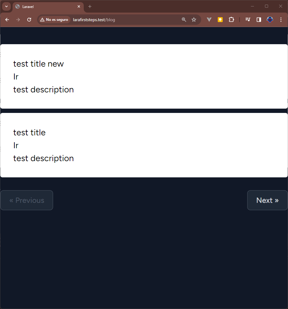
</div>We will see:
Slot
Slots allow adding extra HTML/PHP content to our component; with the slots, we can easily customize the components indicating through sections where we want to place the extra content.
For example, in a listing component that looks like the following:
We may be interested in customizing the title, the footer and perhaps a section to add additional content (as we showed in the previous image); each of these sections may be a slot.
- We can use a list like the one above to indicate the latest posts.
- Also, to build a list based on an established category, in this case, we change the title and footer to show information about the category and in the extra content we place the courses related to the categories.
Of course these are just two examples, the important thing to note is that we can create multiple listings using the same component and update sections to customize the experience on each slot.
Slots can be used in many ways, let's see what they are.
Default slot
By default, we can use the component as if it were an HTML element, indicating an opening tag and a closing tag; in the middle (between the labels), we place the content of the default slot:
resources\views\blog\index.blade.php
@extends('blog.master')

@section('content')
    <x-blog.post.index  :posts="$posts">
        Posts
    </x-blog.post.index >
@endsection
Then, from the component, we consume this content using the slot variable:
resources\views\components\blog\post\index.blade.php
<div>
    <h1>{{ $slot }}</h1>
    @foreach ($posts as $p)
        <div class="card mt-2">
            <h3>
                {{ $p->title }}
            </h3>
            <a href="{{ route('blog.show', $p) }}">Ir</a>
            <p>{{ $p->description }}</p>
        </div>
    @endforeach
    {{ $posts->links() }}
</div>
We will see the title of "Posts" in an H1:
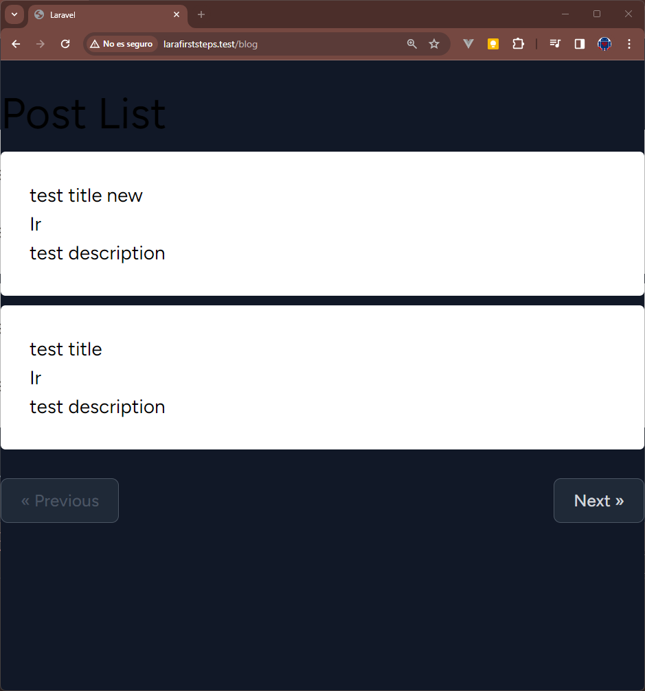
Slots with name
As mentioned before, many times it is necessary to define multiple sections in a component to define the extra content, therefore, with components we can have complex structures passing multiple data to customize them; for this, we can define slots with names; the name is used both to declare the slot and its contents.
We can define a specific slot, like a header, and ideally wrap it in a @isset conditional so that it doesn't break the application if we decide not to send it:
In this example, we define three named slots, "header", "footer" and "extra" respectively:
resources\views\blog\index.blade.php
@extends('blog.master')
@section('content')
    <x-blog.post.index :posts='$posts'>
        Post List
        @slot('footer')
            Footer
        @endslot
        @slot('extra')
            Extra
        @endslot
    </x-blog.post.index>
@endsection
How to send it from the view
At the view level, the names of the slots are used as variables:
resources\views\components\blog\post\index.blade.php
<div>
   <br>
   <h1>{{ $slot }}</h1>
   @if (isset($header))
    <h1>{{ $header }}</h1>
   @endif
    @foreach ($posts as $p)
        <div class="card card-white mt-2">
            <h3>{{ $p->title }}</h3>
            <a href="{{ route('blog.show', $p) }}">Ir</a>
            <p>{{ $p->description }}</p>
        </div>
    @endforeach
    <br>
    @isset($extra)
        <h1>{{ $extra }}</h1>
    @endisset
    <h1>{{ $footer }}</h1>
    {{ $posts->links() }}
</div>
And we'll see:
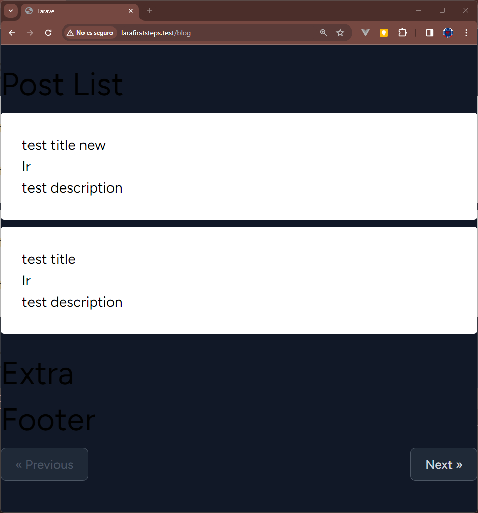
In the previous example, you can see that from the component, it checks whether the named slot is being supplied using conditionals and the isset() directive, therefore, depending on how you define your slots, they may be optional, as in case of the slot for the title and extra or mandatory as in the case of the footer slot.
Slots with name on a line
Many times it is not necessary to pass a complete HTML content in the slots, if not, only a value, a text or a number; in these cases, we can use the following syntax:
resources\views\blog\blog\index.blade.php
<x-blog.post.index :posts="$posts" title='Listado inicial'>
    @slot('other', 'Extra')
</x-blog.post.index>
And from the component:
resources\views\components\web\blog\post\index.blade.php
There is nothing to change and we will see the same image shown above.
Slots or Props? (Key Differences)
You might be wondering: Why use a Slot if I can pass a String through a Prop?
The main difference is the HTML.
- Props: These are ideal for passing raw data (strings, booleans, collections, or models).
- Slots: These are perfect when you want to pass blocks of HTML code. For example, if you want the title to be an <h1> in one place and an <h2> with an icon next to it in another, a Slot gives you complete rendering freedom.
Using props in Laravel components to set default classes
Many times we need to configure a component indicating a default class but that it can be customized when consuming the Laravel component, for example, a letter component, in which, by default we use a white color for the background but, at the moment If another background color is selected, white is not used.
The Challenge: Avoid Style Conflicts
Suppose we have a card component that uses Tailwind CSS classes for styling. Simultaneously loading default styles and user-defined styles can cause conflicts. Specifically, one set of styles could override the other, depending on the order in which they appear in the style sheet.
To address this challenge, we can leverage component props to provide default values. This way we ensure that the default styles are applied unless explicitly modified by the user.
Using Props for Customization
Let's create a card component in Laravel that allows users to customize the background color. We will define a default background color (white) and define the option to set a different color using props.
<!-- card.blade.php -->

@props(['id' => null, 'bg' => 'bg-white'])

@isset($logo)
    <div>
        {{ $logo }}
    </div>
@endisset

<div {!! $attributes->merge(['class' => 'w-full mt-2 '. $bg .' shadow-md overflow-hidden']) !!}>

    @isset($extra)
        <div class="border-b border-gray-200">
            {{ $extra }}
        </div>
    @endisset

    @isset($title)
        <div class="border-b border-gray-200">
            <div class="px-3 pb-1 pt-2">
                {{ $title }}
            </div>
        </div>
    @endisset

    <div class="px-3 py-2">
        {{ $slot }}
    </div>

</div>
And this is precisely a very important point, avoiding using the white background color and not the one specified at the time of consuming the component, specifically we are talking about tailwind classes, since loading both at the same time will bring the problem of that one of them will override the other depending on which part of the style sheet is being used; to avoid this, we can use props at the component level, giving a default value:
@props(['id' => null, 'bg' => 'bg-white'])And from the component, we inject it as follows:
@props(['id' => null, 'bg' => 'bg-white'])

@isset($logo)
    <div>
        {{ $logo }}
    </div>
@endisset

<div {!! $attributes->merge(['class' => 'w-full mt-2 '. $bg .' shadow-md overflow-hidden']) !!}>

    @isset($extra)
        <div class="border-b border-gray-200">
            {{ $extra }}
        </div>
    @endisset

    @isset($title)
        <div class="border-b border-gray-200">
            <div class="px-3 pb-1 pt-2">
                {{ $title }}
            </div>
        </div>
    @endisset

    <div class="px-3 py-2">
        {{ $slot }}
    </div>

</div>
Then, when using the previous component, which is called card.blade.php, if we want to use the default color of the card, which would be white:
<x-card class="mb-10">
   content
</x-card>
Or if we want to select another background color, for example, purple:
<x-card class="mb-10" bg="bg-purple-300">
   content
</x-card>
And in this easy way, we can use these same steps to any other class that does not necessarily have to be the background color with the components in Laravel.
Let's learn how we can integrate Stripe into Laravel with Cashier.