
Content Index
Confirmation dialogs are simply modals or pop-up windows that appear before performing actions such as deleting, and in which we can place other data using, for example, links in Laravel Inertia.
In this section, I want to show you the official way to use confirmation dialogs or modals. Although we could use the native JavaScript confirm(), it is not aesthetically ideal. In the previous video, we used an external package, but now I want to teach you how to integrate it directly into the interface.
Comparison: Inertia.js vs. Livewire (Flux)
One of the points I like least about Inertia is that it sometimes generates a lot of "noise" with so many components. I believe they should work more on reusability, as a confirmation dialog is an essential element in any system.
If we compare it with Livewire (specifically using Flux), the difference is clear:
- In Livewire/Flux, the implementation is direct and generic. You declare the component and trigger it with a simple click.
<flux:modal.trigger name="edit-profile">
    <flux:button>Edit profile</flux:button>
</flux:modal.trigger>
<flux:modal name="edit-profile" class="md:w-96">
    <div class="space-y-6">
        <div>
            <flux:heading size="lg">Update profile</flux:heading>
            <flux:text class="mt-2">Make changes to your personal details.</flux:text>
        </div>
- In Inertia, we don't have a generic one by default; we have to build it ourselves by integrating third-party components or those from the UI itself (such as Headless UI or Radix).
It is a somewhat tortuous process to have to do this manually every time. Therefore, we are going to create a generic component that we can easily adapt, similar to how it works in other technologies.
Dialog Component Structure
Here I explain how our reusable component works:
Definition of Props and Events
The component receives key data through props to be flexible:
- Title: The title of the modal.
- Operation: The action to be performed.
- Confirmation Name: The text or name of the item we want to validate.
- Item Name: The label of the resource (for example, "Post" or "Category").
resources\js\components\ConfirmDeleteModal.vue
<script setup lang="ts">
import { Form } from '@inertiajs/vue3';
import { ref } from 'vue';
import { Button } from '@/components/ui/button';
import {
    Dialog,
    DialogClose,
    DialogContent,
    DialogDescription,
    DialogFooter,
    DialogHeader,
    DialogTitle,
} from '@/components/ui/dialog';
type Props = {
    open: boolean;
    title: string;
    itemName: string;
    itemLabel: string;
    deleteRoute: object;
};
const props = defineProps<Props>();
const emit = defineEmits<{
    'update:open': [value: boolean];
}>();
const confirmationName = ref('');
const formKey = ref(0);
const handleOpenChange = (nextOpen: boolean) => {
    emit('update:open', nextOpen);
    if (!nextOpen) {
        confirmationName.value = '';
        formKey.value++;
    }
};
</script>
<template>
    <Dialog :open="props.open" @update:open="handleOpenChange">
        <DialogContent>
            <Form
                :key="formKey"
                v-bind="deleteRoute"
                class="space-y-6"
                v-slot="{ processing }"
                @success="handleOpenChange(false)"
            >
                <DialogHeader>
                    <DialogTitle>Are you sure?</DialogTitle>
                    <DialogDescription>
                        This action cannot be undone. This will permanently
                        delete the {{ itemLabel }}
                        <strong>"{{ itemName }}"</strong>.
                    </DialogDescription>
                </DialogHeader>
                <DialogFooter class="gap-2">
                    <DialogClose as-child>
                        <Button variant="secondary"> Cancel </Button>
                    </DialogClose>
                    <Button
                        data-test="delete-confirm"
                        variant="destructive"
                        type="submit"
                        :disabled="processing"
                    >Delete {{ itemLabel }}
                    </Button>
                </DialogFooter>
            </Form>
        </DialogContent>
    </Dialog>
</template>
Reactivity Logic (Composition API)
We use Vue 3 logic to control whether the dialog is open or closed through an update:open event. When the user clicks accept, the child component emits an event to the parent so that it executes the deletion request (usually an Inertia router.delete).
Optional: Confirm via text
In this other example, you can see an extra security validation: the delete button remains disabled until the user correctly types the resource name (title). This prevents accidental deletions.
resources\js\components\ConfirmDeleteTextConfirmModal.vue
<script setup lang="ts">
import { Form } from '@inertiajs/vue3';
import { computed, ref } from 'vue';
import InputError from '@/components/InputError.vue';
import { Button } from '@/components/ui/button';
import {
    Dialog,
    DialogClose,
    DialogContent,
    DialogDescription,
    DialogFooter,
    DialogHeader,
    DialogTitle,
} from '@/components/ui/dialog';
import { Input } from '@/components/ui/input';
import { Label } from '@/components/ui/label';
type Props = {
    open: boolean;
    title: string;
    itemName: string;
    itemLabel: string;
    deleteRoute: object;
};
const props = defineProps<Props>();
const emit = defineEmits<{
    'update:open': [value: boolean];
}>();
const confirmationName = ref('');
const formKey = ref(0);
const canDelete = computed(() => {
    return (
        confirmationName.value.toLowerCase() === props.itemName.toLowerCase()
    );
});
const handleOpenChange = (nextOpen: boolean) => {
    emit('update:open', nextOpen);
    if (!nextOpen) {
        confirmationName.value = '';
        formKey.value++;
    }
};
</script>
<template>
    <Dialog :open="props.open" @update:open="handleOpenChange">
        <DialogContent>
            <Form
                :key="formKey"
                v-bind="deleteRoute"
                class="space-y-6"
                v-slot="{ errors, processing }"
                @success="handleOpenChange(false)"
            >
                <DialogHeader>
                    <DialogTitle>Are you sure?</DialogTitle>
                    <DialogDescription>
                        This action cannot be undone. This will permanently
                        delete the {{ itemLabel }}
                        <strong>"{{ itemName }}"</strong>.
                    </DialogDescription>
                </DialogHeader>
                <div class="space-y-4 py-4">
                    <div class="grid gap-2">
                        <Label for="confirmation-name">
                            Type
                            <strong>"{{ itemName }}"</strong> to confirm
                        </Label>
                        <Input
                            id="confirmation-name"
                            name="confirmation"
                            data-test="delete-confirmation-name"
                            v-model="confirmationName"
                            placeholder="Enter name"
                            autocomplete="off"
                        />
                        <InputError :message="errors.confirmation" />
                    </div>
                </div>
                <DialogFooter class="gap-2">
                    <DialogClose as-child>
                        <Button variant="secondary"> Cancel </Button>
                    </DialogClose>
                    <Button
                        data-test="delete-confirm"
                        variant="destructive"
                        type="submit"
                        :disabled="!canDelete || processing"
                    >
                        Delete {{ itemLabel }}
                    </Button>
                </DialogFooter>
            </Form>
        </DialogContent>
    </Dialog>
</template>
Usage
We integrate it into the post listing:
resources\js\pages\dashboard\post\Index.vue
import ConfirmDeleteModal from '@/components/ConfirmDeleteModal.vue';
***
const openDeleteModal = (post: { id: number; title: string }) => {
    postToDelete.value = post;
    deleteModalOpen.value = true;
};
***
<DropdownMenuItem
    class="cursor-pointer text-destructive focus:text-destructive"
    @click="
        openDeleteModal({
            id: row.id,
            title: row.title,
        })
    "
>
    <Trash2 class="mr-2 h-4 w-4" />
    Delete
</DropdownMenuItem>
***
<ConfirmDeleteModal
    v-if="postToDelete"
    :open="deleteModalOpen"
    :title="postToDelete.title"
    :item-name="postToDelete.title"
    item-label="post"
    :delete-route="destroy.form(postToDelete.id)"
    @update:open="deleteModalOpen = $event"
/>
Inertia offers several interesting components, but, as you may realize, some others are missed such as to handle confirmation dialogs and toast messages; however, the fact that it doesn't exist is a good thing, because, Inertia by using Vue, we already rely on a large amount of plugins ready to use as we have demonstrated in the previous chapters and with this, we can customize our application and do without as much as possible integrations that could come by default in Inertia.js
For dialogs and toasts, you can use any plugin, but, by having Oruga UI installed; we are going to take advantage of the components that already exist in it and with this, avoid installing additional packages.
Configure the confirmation dialog
As we saw in the basic Laravel book, in Oruga UI, we have a modal component:
https://oruga.io/components/modal.html
Which looks like:

Which is ultimately nothing more than an empty container in which we can place texts, images, forms and, ultimately, any HTML content.
Confirmation dialog for deletion
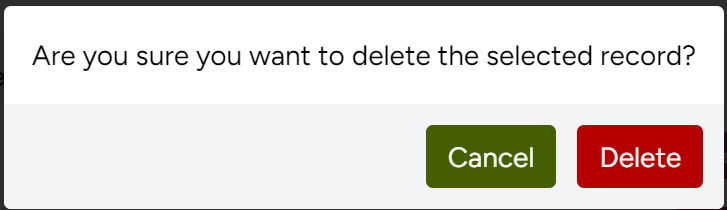
Let's start by adapting the confirmation dialog for deleting posts; to do this, we are going to place the confirmation text and the action buttons; one to delete and another to cancel:
resources/js/pages/dashboard/category/Index.vue
<template>
    <Head title="Categories" />
    <o-modal v-model:active="confirmDeleteActive">
    <p class="p-4 text-black">Are you sure you want to delete the selected record?</p>
    <div class="flex flex-row-reverse gap-2 bg-gray-100 p-3">
      <o-button variant="danger" @click="deleteCategory">Delete</o-button>
      <o-button @click="confirmDeleteActive = false">Cancel</o-button>
    </div>
  </o-modal>
***
<DropdownMenuSeparator />
    <DropdownMenuItem as-child>
    <Button
        variant="destructive"
        @click="confirmDeleteActive = true; deleteCategoryRow = category.id"
        class="w-full"
    >
        <Trash2 class="mr-2 h-4 w-4" />
        Delete
    </Button>
</DropdownMenuItem>
<!-- <Form
    v-bind="destroy.form(category.id)"
    v-slot="{ processing }"
>
    <DropdownMenuItem
        class="cursor-pointer text-destructive focus:text-destructive"
        :disabled="processing"
        as="button"
        type="submit"
    >
        <Trash2 class="mr-2 h-4 w-4" />
        Delete
    </DropdownMenuItem>
</Form> -->
<script>
import { ref } from 'vue';
***
const confirmDeleteActive = ref(false);
const deleteCategoryRow = ref<number | string>(""); // We save the ID here
const deleteCategory = () => {
    // 1. We use .value to get the saved ID
    // 2. We execute the deletion action
    router.delete(destroy(deleteCategoryRow.value).url, {
        preserveScroll: true,
        onSuccess: () => {
            confirmDeleteActive.value = false;
            deleteCategoryRow.value = "";
        }
    });
};
</script>
Remember that all these changes apply to:
resources/js/pages/dashboard/category/Index.vue
To display the modal, we use a boolean property and to handle the record we want to delete, we use another property that contains the id of the record we want to delete; so, we create the respective properties:
const confirmDeleteActive = ref(false);
const deleteCategoryRow = ref<number | string>(""); // We save the ID here
From the actions section in the list, now, the operation to delete will only register the ID of the post to be deleted:
We create a function that deletes the post:
const deleteCategory = () => {
    // 1. We use .value to get the saved ID
    // 2. We execute the deletion action
    router.delete(destroy(deleteCategoryRow.value).url, {
        preserveScroll: true,
        onSuccess: () => {
            confirmDeleteActive.value = false;
            deleteCategoryRow.value = "";
        }
    });
};
And finally, returning to the action buttons, the cancel one simply hides the modal with the property responsible for indicating whether the modal is visible or not:
<o-button @click="confirmDeleteActive = false">Cancel</o-button>And the confirmation one calls the function defined previously:
<o-button variant="danger" @click="deleteCategory">Delete</o-button>And from the list:
<DropdownMenuSeparator />
    <DropdownMenuItem as-child>
    <Button
        variant="destructive"
        @click="confirmDeleteActive = true; deleteCategoryRow = category.id"
        class="w-full"
    >
        <Trash2 class="mr-2 h-4 w-4" />
        Delete
    </Button>
</DropdownMenuItem>
With this, when pressing delete on the list, we will have:
The next step is for you to learn how to use Flash Messages in Laravel Inertia.