The DataTable to be able to display information in an organized way in Flutter
- Andrés Cruz

A DataTable is a user interface component that is used to display data in the form of a table. Typically used in web or mobile applications to present data in a grid with interactive rows and columns. Users can interact with a DataTable to sort, search, filter, and paginate large data, making it a useful tool for presenting information in a clear and easily accessible way. In short, a DataTable is a user interface element used to display data in an interactive table.
We are going to present a very useful flutter widget, the DataTable widget, to present data in an organized way in a grid or table in flutter; to present information and this information can be text, images, buttons that in summary are widgets; we are going to present all the code of the example that we are going to analyze:
DataTable(
                sortColumnIndex: 2,
                sortAscending: false,
                columns: [
                  DataColumn(label: Text("Nombre")),
                  DataColumn(label: Text("Apellido")),
                  DataColumn(label: Text("Años"), numeric: true),
                ],
                rows: [
                  DataRow(
                    selected: true,
                    cells: [
                    DataCell(Text("Andres"), showEditIcon: true),
                    DataCell(Text("Cruz")),
                    DataCell(Text("28"))
                  ]),
                  DataRow(cells: [
                    DataCell(Text("Ramos")),
                    DataCell(Text("Ayu")),
                    DataCell(Text("999"))
                  ])
                ],
              )
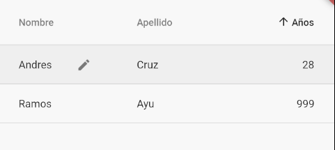
With this we get a simple table like the following:

As you well know if you are also a web developer or have also tried to use the grid on mobile platforms; grids are not adaptive, which makes data visualization difficult; but with this widget we can use it in conjunction with others that will even allow us to create a horizontal scroll, etc.
Setting up a DataTable in flutter
The table or Datatable in its minimal configuration needs to define the DataColumn to define the label of the columns and the DataRow that are to define the data within the rows property (in addition to the DataTable itself of course); what you have to take into account is that you must define the same DataColumn as the DataCell inside a DataRow.
There are multiple properties that you can use at ease to customize the columns, rows, cells or the table itself; let's see some of the main ones:
Selected row
Using the selected in the DataRow you can indicate that you want to highlight a row in question, which will appear with a soft gray as you can see in the previous image.
Editable cell
Through the showEditIcon in the DataCell you can specify an icon of a pencil to indicate that the cell in question can be editable, although this does not mean that said attribute implements editing in the cell; all it does is draw said icon.
Ordering
We can also establish representative icons to show that a column can be ordered; for that we can indicate the index of the column that you want to sort sortColumnIndex and indicate if you want to show the icon to sort ascending or not sortAscending.

Develop with Laravel, Django, Flask, CodeIgniter, HTML5, CSS3, MySQL, JavaScript, Vue, Android, iOS, Flutter
