
Content Index
- Introduction to Cards in Jetpack Compose
- Basic Cards
- Improving the Design with Modifiers
- Creating a “Nice Card”
- The power of Layout: Box vs. Column/Row
- Rest of the design
- Conclusion and Practice
- CardViews with XML and Kotlin (Legacy Approach)
- What is a CardView for?
- Creating our CardView with ConstraintLayout
- The Complete Layout
- (Optional) Fonts in Android
Let's see how to work with Cards, which is the modern approach, or CardViews, which is the View-based approach with XML.
We agreed that we know how to use Dialogs in Android with Jetpack Compose.
Introduction to Cards in Jetpack Compose
Cards are another essential UI element. As always, if you do a quick search like "Card Android Studio Compose", you'll see that the official documentation offers clear examples on how to change parameters like elevation (for shadows) and colors.
By convention, a card is simply a container, usually with rounded corners and an elevation that gives it depth. It is ideal for presenting data in an organized way. For now, we are not going too deep into design, but we will soon practice with a real application.
Basic Cards
The basic usage in Compose is extremely simple. You just call the Card function and place the content inside, like a text:
@Composable
fun CardMinimalExample() {
    Card() {
        Text(text = "Hello, world!")
    }
}
@Composable
fun FilledCardExample() {
    Card(
        colors = CardDefaults.cardColors(
            containerColor = MaterialTheme.colorScheme.surfaceVariant,
        ),
        modifier = Modifier
            .size(width = 240.dp, height = 100.dp)
    ) {
        Text(
            text = "Filled",
            modifier = Modifier
                .padding(16.dp)
        )
    }
}
@Preview(showBackground = true)
@Composable
fun CardPreview() {
    MyProyectAndroidTheme {
//        FilledCardExample()
        CardBonito()
    }
}
Improving the Design with Modifiers
A basic example can be boring, so let's improve it. Using Modifiers, we can define the maximum and minimum size and the padding:
.size(width = 240.dp, height = 100.dp)Remember that in Android we work with pixel densities (dp) and not with direct pixels.
Creating a “Nice Card”
For this exercise, I wanted to recreate a design similar to the old XML approach (CardView) which is at the bottom of this Post. But using the power of Compose. I asked Gemini for assistance to generate a more visual interface and this was the result:
We use a Composable function called CardBonito that receives parameters and modifiers:
@Composable
fun CardBonito(
    count: String = "123",
    date: String = "20/01/2026",
    title: String = "Example Title",
    direction: String = "Av. Siempre Viva 123",
    mount: String = "$1,500.00"
) {
    // The main Box acts as the RelativeLayout container
    Box(
        modifier = Modifier
            .fillMaxWidth()
            .padding(16.dp)
    ) {
        // 1. THE CARD (Main data container)
        Card(
            modifier = Modifier
                .fillMaxWidth()
                .padding(top = 24.dp), // Space for the "Mount" that sticks out at the top
            shape = RoundedCornerShape(5.dp),
            colors = CardDefaults.cardColors(containerColor = Color(0xFF6200EE)) // Example color
        ) {
            Column(
                modifier = Modifier
                    .padding(10.dp)
                    .fillMaxWidth()
            ) {


            }
        }
        // 2. THE AMOUNT (Centered text at the top that sticks out)
        Surface(
            modifier = Modifier.align(Alignment.TopCenter),
            color = Color(0xFF3700B3), // Background color of the amount
            shape = RoundedCornerShape(8.dp),
            shadowElevation = 4.dp
        ) {

        }
        // 3. THE FLOATING BUTTONS (FABs in horizontal)
        Row(
            modifier = Modifier
                .align(Alignment.BottomCenter) // We position them at the bottom center
                .offset(y = 20.dp), // We move them out of the card for the visual effect
            horizontalArrangement = Arrangement.spacedBy(16.dp)
        ) {

        }
    }
}
The power of Layout: Box vs. Column/Row
Here comes the trick of the exercise: how do we place "floating" or overlapping elements? For this we use the Box, which is the equivalent of the RelativeLayout. Unlike Column (vertical) or Row (horizontal), where each element occupies its own space and cannot overlap, the Box is the equivalent of the RelativeLayout. It works like a stack of books:
- The first element (the Card) serves as a canvas or base.
- The following elements are stacked on top.
If we remove the Box and the alignments, all the elements would be piled up on top of each other in the upper left corner. Thanks to this tool, we can superimpose icons or labels on the card without altering its internal structure.
Rest of the design
The rest of the design is more of the same, texts, buttons and icons with style:
@Composable
fun CardBonito(
    count: String = "123",
    date: String = "20/01/2026",
    title: String = "Example Title",
    direction: String = "Av. Siempre Viva 123",
    mount: String = "$1,500.00"
) {
    // The main Box acts as the RelativeLayout container
    Box(
        modifier = Modifier
            .fillMaxWidth()
            .padding(16.dp)
    ) {
        // 1. THE CARD (Main data container)
        Card(
            modifier = Modifier
                .fillMaxWidth()
                .padding(top = 24.dp), // Space for the "Mount" that sticks out at the top
            shape = RoundedCornerShape(5.dp),
            colors = CardDefaults.cardColors(containerColor = Color(0xFF6200EE)) // Example color
        ) {
            Column(
                modifier = Modifier
                    .padding(10.dp)
                    .fillMaxWidth()
            ) {
                // Top Row (Count and Date) - Equivalent to the internal RelativeLayout
                Row(
                    modifier = Modifier.fillMaxWidth(),
                    horizontalArrangement = Arrangement.SpaceBetween
                ) {
                    Text(text = count, color = Color.White, fontWeight = FontWeight.Bold, style = MaterialTheme.typography.bodySmall)
                    Text(text = date, color = Color.White, fontWeight = FontWeight.Bold, style = MaterialTheme.typography.bodySmall)
                }
                Spacer(modifier = Modifier.height(16.dp))
                // Title
                Text(
                    text = title,
                    color = Color.White,
                    fontSize = 20.sp,
                    fontFamily = FontFamily.SansSerif,
                    fontWeight = FontWeight.Medium
                )
                // Direction
                Text(
                    text = direction,
                    color = Color.White,
                    style = MaterialTheme.typography.bodySmall
                )
                // Extra space at the end (the empty View of the XML)
                Spacer(modifier = Modifier.height(24.dp))
            }
        }
        // 2. THE AMOUNT (Centered text at the top that sticks out)
        Surface(
            modifier = Modifier.align(Alignment.TopCenter),
            color = Color(0xFF3700B3), // Background color of the amount
            shape = RoundedCornerShape(8.dp),
            shadowElevation = 4.dp
        ) {
            Text(
                text = mount,
                modifier = Modifier.padding(horizontal = 16.dp, vertical = 8.dp),
                color = Color.White,
                style = MaterialTheme.typography.headlineMedium,
                fontFamily = FontFamily.SansSerif
            )
        }
        // 3. THE FLOATING BUTTONS (FABs in horizontal)
        Row(
            modifier = Modifier
                .align(Alignment.BottomCenter) // We position them at the bottom center
                .offset(y = 20.dp), // We move them out of the card for the visual effect
            horizontalArrangement = Arrangement.spacedBy(16.dp)
        ) {
            SmallFloatingActionButton(
                onClick = { /* Info */ },
                containerColor = MaterialTheme.colorScheme.primary
            ) {
                Icon(Icons.Default.Info, contentDescription = "Info")
            }
            SmallFloatingActionButton(
                onClick = { /* Edit */ },
                containerColor = MaterialTheme.colorScheme.secondary
            ) {
                Icon(Icons.Default.Edit, contentDescription = "Edit")
            }
        }
    }
}- Instead of just using Column, we use a Row with Arrangement.SpaceBetween. This moves the elements to the extremes (like the amount and the date), very similar to how it's done in Flutter.
- We use Spacer with measurements in dp to separate elements, and for texts we use sp (scalable pixels), which is the standard unit for typography.
- In the code you will see that I used a Surface to display the amount. Technically, the Surface is a lower-level element; in fact, the Card implements a Surface underneath to add functionalities such as shadows or click events (onClick). For practical purposes, both are similar, but the Card has additional features ready to use.
- Through the align modifier, we decide where to place each piece (top center, bottom right, etc.).
Conclusion and Practice
As you can see in the emulator, the result is a very powerful declarative interface. I invite you to take the code from the repository, change the values of the Arrangement (try with .Center or .SpaceAround) and vary the alignments of the Box. The best way to understand this interface is to break it and put it back together.
CardViews with XML and Kotlin (Legacy Approach)
We will see how to create custom CardViews with modern Android development tools. We will focus on the view using AndroidX, Material Components and ConstraintLayout, without going into the logic of the Activity. The goal is to design a complex list item with several options, information and a highlighted section.
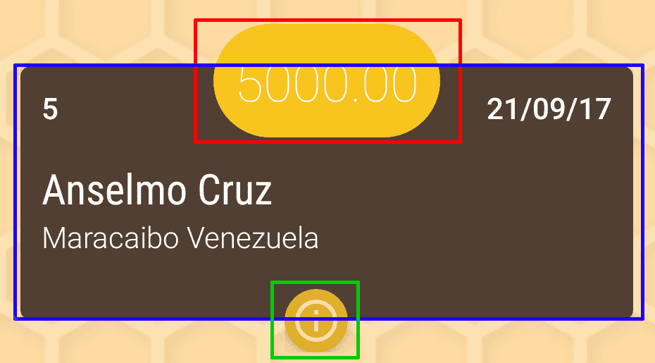
CardViews are excellent containers for displaying data in a summarized and detailed way; they are widely used to create the items of the lists using RecyclerViews.
As you can see in the promotional image, there are certain elements aligned in a way that at first glance may not be so easy to deduce their organization, but in reality its construction is not complex.
Summarizing a bit and indicating each of the elements in the following image in descending order, our view will have 3 main sections:
- Featured section.
- The
CardViewas such. - The options section.
What is a CardView for?
CardViews are a Material Design component that have a design similar to a native widget, with the typical shading and rounded corners. They are widely used in conjunction with RecyclerViews.
It contains a series of unique properties such as corner rounding (app:cardCornerRadius), elevation (app:cardElevation), etc. You can consult the official documentation for more information: Create views with cards.
Creating our CardView with ConstraintLayout
To create our design, we will use a ConstraintLayout as the main container. This layout allows us to create flat and complex view hierarchies with superior performance, being the option recommended by Google over nested RelativeLayout or LinearLayout.
Within the ConstraintLayout, we will define 3 main elements anchored to each other:
- The
CardViewfromandroidx.cardview.widget.CardView. - The
TextViewfor the featured section, positioned to overlap with the top edge of theCardView. - A
LinearLayoutwith theFloatingActionButtons fromcom.google.android.material.floatingactionbutton.FloatingActionButtonfor the options.
The trick to overlapping is to play with the margins and elevation. The CardView has a top margin to leave space for the featured TextView, and this in turn has an elevation to ensure that it is drawn on top of the card. The buttons (FABs) are anchored to the bottom of the CardView with a negative margin so that they overlap slightly.
The Complete Layout
Below is the complete XML code for the layout. Notice how the app:layout_constraint... attributes define the relationships between the elements to achieve the desired design.
<?xml version="1.0" encoding="utf-8"?>
<androidx.constraintlayout.widget.ConstraintLayout xmlns:android="http://schemas.android.com/apk/res/android"
    xmlns:app="http://schemas.android.com/apk/res-auto"
    android:layout_width="match_parent"
    android:layout_height="wrap_content"
    android:paddingStart="15dp"
    android:paddingEnd="15dp"
    android:paddingBottom="16dp">
    <!-- Main CardView -->
    <androidx.cardview.widget.CardView
        android:id="@+id/cvContainer"
        android:layout_width="0dp"
        android:layout_height="wrap_content"
        android:layout_marginTop="45dp"
        android:foreground="?android:attr/selectableItemBackground"
        app:cardCornerRadius="5dp"
        app:layout_constraintEnd_toEndOf="parent"
        app:layout_constraintStart_toStartOf="parent"
        app:layout_constraintTop_toTopOf="parent">
        <androidx.constraintlayout.widget.ConstraintLayout
            android:id="@+id/clContainer"
            android:layout_width="match_parent"
            android:layout_height="wrap_content"
            android:gravity="center_vertical"
            android:padding="10dp">
            <TextView
                android:id="@+id/tvCount"
                android:layout_width="wrap_content"
                android:layout_height="wrap_content"
                android:fontFamily="sans-serif-light"
                android:text="title"
                android:textAppearance="?android:attr/textAppearanceSmall"
                android:textColor="#FFFFFF"
                android:textStyle="bold"
                app:layout_constraintStart_toStartOf="parent"
                app:layout_constraintTop_toTopOf="parent" />
            <TextView
                android:id="@+id/tvDate"
                android:layout_width="wrap_content"
                android:layout_height="wrap_content"
                android:fontFamily="sans-serif-light"
                android:gravity="right"
                android:text="title"
                android:textAppearance="?android:attr/textAppearanceSmall"
                android:textColor="#FFFFFF"
                android:textStyle="bold"
                app:layout_constraintEnd_toEndOf="parent"
                app:layout_constraintTop_toTopOf="parent" />
            <TextView
                android:id="@+id/tvTitle"
                android:layout_width="0dp"
                android:layout_height="wrap_content"
                android:layout_marginTop="15dp"
                android:layout_marginEnd="5dp"
                android:fontFamily="sans-serif-condensed"
                android:text="title"
                android:textColor="#FFFFFF"
                android:textSize="20sp"
                app:layout_constraintEnd_toEndOf="parent"
                app:layout_constraintStart_toStartOf="parent"
                app:layout_constraintTop_toBottomOf="@id/tvCount" />
            <TextView
                android:id="@+id/tvDirection"
                android:layout_width="0dp"
                android:layout_height="wrap_content"
                android:layout_marginTop="4dp"
                android:fontFamily="sans-serif-light"
                android:text="title"
                android:textAppearance="?android:attr/textAppearanceSmall"
                android:textColor="#FFFFFF"
                app:layout_constraintEnd_toEndOf="parent"
                app:layout_constraintStart_toStartOf="parent"
                app:layout_constraintTop_toBottomOf="@id/tvTitle" />
            <!-- Spacer to give height to the CardView -->
            <Space
                android:layout_width="match_parent"
                android:layout_height="20dp"
                app:layout_constraintTop_toBottomOf="@id/tvDirection"
                app:layout_constraintStart_toStartOf="parent" />
        </androidx.constraintlayout.widget.ConstraintLayout>
    </androidx.cardview.widget.CardView>
    <!-- Options section (FABs) -->
    <LinearLayout
        android:id="@+id/llFabContainer"
        android:layout_width="wrap_content"
        android:layout_height="wrap_content"
        android:orientation="horizontal"
        android:layout_marginTop="-20dp"
        app:layout_constraintEnd_toEndOf="parent"
        app:layout_constraintStart_toStartOf="parent"
        app:layout_constraintTop_toBottomOf="@id/cvContainer">
        <com.google.android.material.floatingactionbutton.FloatingActionButton
            android:id="@+id/fabInfo"
            android:layout_width="wrap_content"
            android:layout_height="wrap_content"
            android:layout_marginEnd="10dp"
            android:src="@drawable/ic_action_info_outline"
            app:fabSize="mini" />
        <com.google.android.material.floatingactionbutton.FloatingActionButton
            android:id="@+id/fabEdit"
            android:layout_width="wrap_content"
            android:layout_height="wrap_content"
            android:src="@drawable/ic_action_edit"
            app:fabSize="mini" />
    </LinearLayout>
    <!-- Featured section -->
    <TextView
        android:id="@+id/tvMount"
        android:layout_width="wrap_content"
        android:layout_height="wrap_content"
        android:background="@drawable/layout_bg_corner_mount_1"
        android:fontFamily="sans-serif-thin"
        android:padding="10dp"
        android:text="title"
        android:textAppearance="?android:attr/textAppearanceLarge"
        android:textColor="#FFFFFF"
        android:textSize="25sp"
        app:layout_constraintEnd_toEndOf="parent"
        app:layout_constraintStart_toStartOf="parent"
        app:layout_constraintTop_toTopOf="parent"
        android:layout_marginTop="25dp"
        android:elevation="8dp"/>
</androidx.constraintlayout.widget.ConstraintLayout>
The values for dimensions (dimens.xml), colors (colors.xml) and shapes (drawable) are still fundamental concepts. Those used in the original design are compatible with this new layout.
dimens.xml
<dimen name="space_component2x">10dp</dimen>
<dimen name="space_component3x">15dp</dimen>
<dimen name="fab_margin">10dp</dimen>
<dimen name="space_big">20dp</dimen>
<dimen name="card_detail_mount_margin">45dp</dimen>
drawable/layout_bg_corner_mount_1.xml
<?xml version="1.0" encoding="UTF-8"?>
<shape xmlns:android="http://schemas.android.com/apk/res/android">
    <solid android:color="@color/colorFive"/>
    <stroke android:width="3dp" android:color="@color/colorFive" />
    <corners android:radius="30dp"/>
    <padding android:left="0dp" android:top="0dp" android:right="0dp" android:bottom="0dp" />
</shape>
colors.xml
<color name="colorFive">#F7C51E</color>(Optional) Fonts in Android
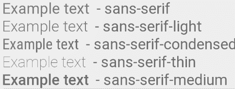
To give it a bit of style, you can change the font. The values of android:fontFamily are still valid:
android:fontFamily="sans-serif"           // roboto regular
android:fontFamily="sans-serif-light"     // roboto light
android:fontFamily="sans-serif-condensed" // roboto condensed
android:fontFamily="sans-serif-black"     // roboto black
android:fontFamily="sans-serif-thin"      // roboto thin (API 16+)
android:fontFamily="sans-serif-medium"    // roboto medium (API 21+)
Represented in the following image:
Today, the recommended way to use custom fonts is through the res/font resource folder. This allows you to package font files (.ttf or .otf) directly into your APK and access them safely with android:fontFamily="@font/my_font".
The next step is to learn how to use the RecyclerView in Jetpack Compose - LazyColumn and LazyRow