Content Index
- Implementing a Navigation Drawer in Jetpack Compose
- Why is the Scaffold implemented inside the Drawer?
- ️ State and Coroutine Management
- ModalNavigationDrawer Structure
- The Drawer's content (ModalDrawerSheet)
- The Scaffold and the TopBar
- Conclusion
- Navigation Drawer - XML (Legacy)
- Creating a side menu
- Side menu properties
- Define a header
- Groups in our side menu items
- Define an option as clickable + group title
- Creating the NavigationDrawer with ListViews (Legacy Approach)
- 1. Creating the Drawer Layout
- 2. Referencing the Drawer Layout and the Navigation Drawer
- 3. Defining the Adapter with the options structure
- 4. Configuring the open and close events of the side menu with the application icon
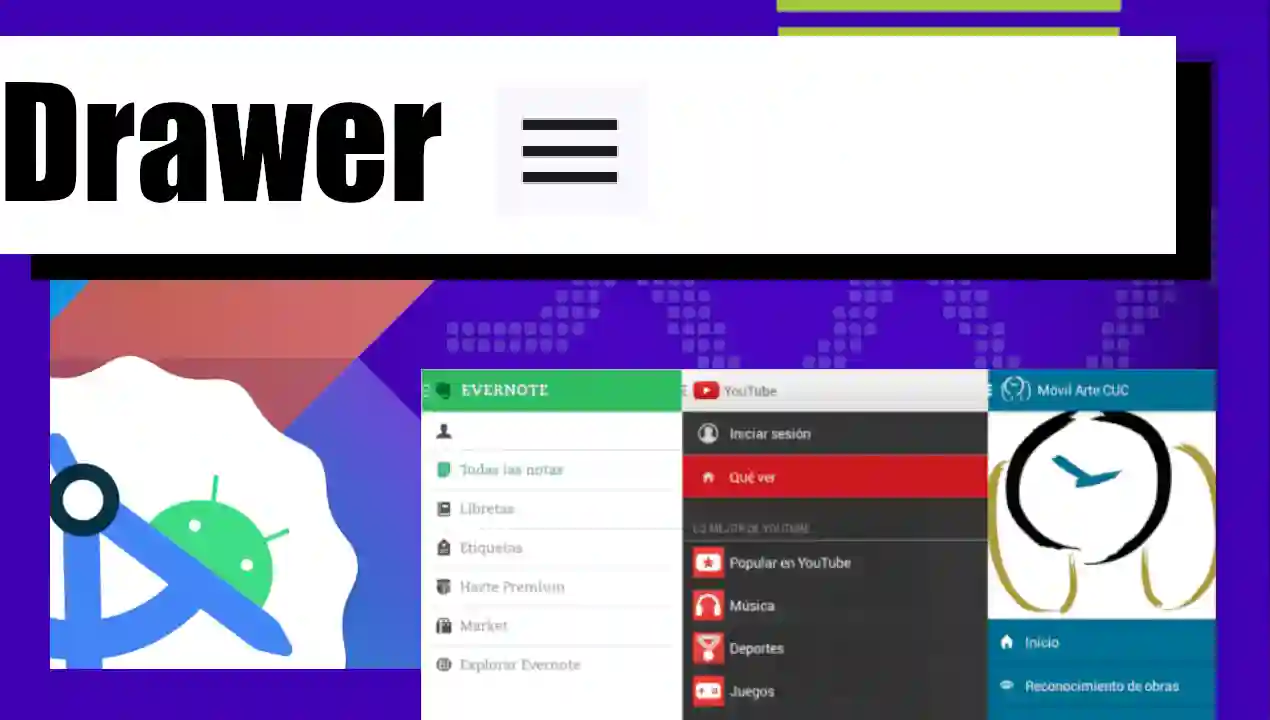
The Navigation Drawer is a panel that expands and collapses from the left side of the device screen and displays a menu of the application's navigation options; it is possible to show the side menu by tapping on the left side of the screen and dragging to the right or by tapping the application icon located on the action bar.
Previously we saw another type of Drawer, the Bottom Sheets, in Android Studio.
Implementing a Navigation Drawer in Jetpack Compose
Let's learn how to create our Drawer (side menu). We will see a simple example based on the Composables we have studied. Although it is a minimal example, the important thing is that you understand how it works so that you can then customize it to your liking.
The structure of the Drawer is a bit more complex than that of a simple button; like Bottom Sheets or Dialogs, it requires a more elaborate organization.
Why is the Scaffold implemented inside the Drawer?
In this example, you will notice that the Scaffold does not wrap the Drawer, but the Drawer wraps the Scaffold. The reason is that the ModalNavigationDrawer is now the main container that manages the state of the interface.
For this to work reactively, we must declare the states outside the activity's life cycle (of onCreate) and keep them within a Composable function. If you try to declare them in the activity, Android will throw an error:
val drawerState = rememberDrawerState(initialValue = DrawerValue.Closed)
val scope = rememberCoroutineScope()

// State to know which item is selected
var selectedItem by remember { mutableIntStateOf(0) }
️ State and Coroutine Management
To handle the visibility of the menu, we need a couple of key elements:
- DrawerState: A special remember-type variable that handles whether the Drawer is open (Open) or closed (Closed). By default, we initialize it to Closed.
- CoroutineScope: As with Snackbars, showing or hiding the Drawer involves an animation that takes milliseconds. Since these functions are suspended (asynchronous), they cannot be executed on the main thread directly; we need to launch a coroutine to trigger them.
val drawerState = rememberDrawerState(initialValue = DrawerValue.Closed)
val scope = rememberCoroutineScope()

// State to know which item is selected
var selectedItem by remember { mutableIntStateOf(0) }
ModalNavigationDrawer Structure
The main component is the ModalNavigationDrawer. This receives the state we declare and defines the content that will appear in the side panel.
The Drawer's content (ModalDrawerSheet)
Inside the Drawer, we use ModalDrawerSheet to define the visual part. Here you can customize it as you wish:
- Header: You can use a Text with large typography styles and a Spacer to prevent it from sticking to the top edge.
ModalDrawerSheet {
    Spacer(Modifier.height(12.dp))
    Text("My App", modifier = Modifier.padding(16.dp), style = MaterialTheme.typography.titleLarge)
    HorizontalDivider()

    items.forEachIndexed { index, label ->
        NavigationDrawerItem(
            label = { Text(label) },
            selected = index == selectedItem,
            onClick = {
                selectedItem = index
                // We close the drawer after clicking
                scope.launch { drawerState.close() }
            },
            modifier = Modifier.padding(NavigationDrawerItemDefaults.ItemPadding)
        )
    }
}- Dividers: A HorizontalDivider helps to separate sections.
HorizontalDivider()- Navigation items: The ideal is to iterate a list of options. For each option, we use the NavigationDrawerItem component.
NavigationDrawerItem(
   label = { Text(text = item) },
   selected = index == selectedItemIndex,
   onClick = {
       selectedItemIndex = index // We update the selected index
       scope.launch { drawerState.close() } // We close the menu with a coroutine
   }
)
Remaining as:
val drawerState = rememberDrawerState(initialValue = DrawerValue.Closed)
    val scope = rememberCoroutineScope()

    // State to know which item is selected
    var selectedItem by remember { mutableIntStateOf(0) }
    val items = listOf("Home", "Profile", "Settings")

    // 2. The main container of the Drawer
    ModalNavigationDrawer(
        drawerState = drawerState,
        drawerContent = {
            // Visual content of the side menu
            ModalDrawerSheet {
                Spacer(Modifier.height(12.dp))
                Text("My App", modifier = Modifier.padding(16.dp), style = MaterialTheme.typography.titleLarge)
                HorizontalDivider()

                items.forEachIndexed { index, label ->
                    NavigationDrawerItem(
                        label = { Text(label) },
                        selected = index == selectedItem,
                        onClick = {
                            selectedItem = index
                            // We close the drawer after clicking
                            scope.launch { drawerState.close() }
                        },
                        modifier = Modifier.padding(NavigationDrawerItemDefaults.ItemPadding)
                    )
                }
            }
        }
    )
The Scaffold and the TopBar
Once the side panel is defined, we place the Scaffold in the body of the Drawer. The Scaffold serves as a canvas to draw the rest of the interface:
TopAppBar: Here we place the application title (which can change reactively depending on the selected item) and the hamburger icon.
Opening event: When clicking on the icon, we use the coroutine again to execute drawerState.open().
Main content: This is the area where your information is displayed, in this case, a text that indicates which menu option was pressed.
 ModalNavigationDrawer(
        ***
    ) {
        // 3. Main screen content
        Scaffold(
            topBar = {
                TopAppBar(
                    title = { Text("Screen of ${items[selectedItem]}") },
                    navigationIcon = {
                        IconButton(onClick = {
                            // We open the drawer by pressing the menu icon
                            scope.launch { drawerState.open() }
                        }) {
                            Icon(Icons.Default.Menu, contentDescription = "Open menu")
                        }
                    }
                )
            }
        ) { padding ->
            Box(
                modifier = Modifier
                    .fillMaxSize()
                    .padding(padding),
                contentAlignment = Alignment.Center
            ) {
                Text(text = "Content of ${items[selectedItem]}")
            }
        }
    }
Conclusion
There are multiple ways to implement this. You can create static menus (fixed in the code) or dynamic menus (obtained from an API).
- Dynamic Implementation: Useful when options change depending on the user.
- Fixed Implementation: Faster for known configuration or profile menus.
This is another example that you can see in the full exercise:
package com.example.myproyectandroid

import android.graphics.drawable.Icon
import android.os.Bundle
import androidx.activity.ComponentActivity
import androidx.activity.compose.setContent
import androidx.activity.enableEdgeToEdge
import androidx.compose.foundation.layout.Arrangement
import androidx.compose.foundation.layout.Box
import androidx.compose.foundation.layout.Column
import androidx.compose.foundation.layout.PaddingValues
import androidx.compose.foundation.layout.Spacer
import androidx.compose.foundation.layout.fillMaxSize
import androidx.compose.foundation.layout.height
import androidx.compose.foundation.layout.padding
import androidx.compose.foundation.rememberScrollState
import androidx.compose.foundation.verticalScroll
import androidx.compose.material.icons.Icons
import androidx.compose.material.icons.automirrored.outlined.Help
import androidx.compose.material.icons.filled.Menu
import androidx.compose.material.icons.outlined.Settings
import androidx.compose.material3.Button
import androidx.compose.material3.DrawerValue
import androidx.compose.material3.ExperimentalMaterial3Api
import androidx.compose.material3.HorizontalDivider
import androidx.compose.material3.Icon
import androidx.compose.material3.IconButton
import androidx.compose.material3.MaterialTheme
import androidx.compose.material3.ModalDrawerSheet
import androidx.compose.material3.ModalNavigationDrawer
import androidx.compose.material3.NavigationDrawerItem
import androidx.compose.material3.NavigationDrawerItemDefaults

import androidx.compose.material3.Scaffold
import androidx.compose.material3.Text
import androidx.compose.material3.TopAppBar
import androidx.compose.material3.rememberDrawerState

import androidx.compose.runtime.Composable
import androidx.compose.runtime.getValue
import androidx.compose.runtime.mutableIntStateOf
import androidx.compose.runtime.remember
import androidx.compose.runtime.rememberCoroutineScope
import androidx.compose.runtime.setValue
import androidx.compose.ui.Alignment
import androidx.compose.ui.Modifier
import androidx.compose.ui.tooling.preview.Preview
import androidx.compose.ui.unit.dp
import com.example.myproyectandroid.ui.theme.MyProyectAndroidTheme
import kotlinx.coroutines.launch

class MainActivity : ComponentActivity() {
    override fun onCreate(savedInstanceState: Bundle?) {
        super.onCreate(savedInstanceState)
        enableEdgeToEdge()
        setContent {
            MyProyectAndroidTheme {

                FullDrawerExample()

                        /*DetailedDrawerExample { paddingValues ->
                            // This is the "content" that your function requests
                            Column(
                                modifier = Modifier
                                    .fillMaxSize()
                                    .padding(paddingValues) // IMPORTANT: Use the paddings that come from the internal Scaffold
                            ) {
                                Text("Hello! I'm inside the Drawer")
                                Button (onClick = { /* Action */ }) {
                                    Text("Test button")
                                }
                            }
                        }*/

            }
        }

    }
}

@OptIn(ExperimentalMaterial3Api::class)
@Composable
fun FullDrawerExample() {
    // 1. State to open/close the Drawer
    val drawerState = rememberDrawerState(initialValue = DrawerValue.Closed)
    val scope = rememberCoroutineScope()

    // State to know which item is selected
    var selectedItem by remember { mutableIntStateOf(0) }
    val items = listOf("Home", "Profile", "Settings")

    // 2. The main container of the Drawer
    ModalNavigationDrawer(
        drawerState = drawerState,
        drawerContent = {
            // Visual content of the side menu
            ModalDrawerSheet {
                Spacer(Modifier.height(12.dp))
                Text("My App", modifier = Modifier.padding(16.dp), style = MaterialTheme.typography.titleLarge)
                HorizontalDivider()

                items.forEachIndexed { index, label ->
                    NavigationDrawerItem(
                        label = { Text(label) },
                        selected = index == selectedItem,
                        onClick = {
                            selectedItem = index
                            // We close the drawer after clicking
                            scope.launch { drawerState.close() }
                        },
                        modifier = Modifier.padding(NavigationDrawerItemDefaults.ItemPadding)
                    )
                }
            }
        }
    ) {
        // 3. Main screen content
        Scaffold(
            topBar = {
                TopAppBar(
                    title = { Text("Screen of ${items[selectedItem]}") },
                    navigationIcon = {
                        IconButton(onClick = {
                            // We open the drawer by pressing the menu icon
                            scope.launch { drawerState.open() }
                        }) {
                            Icon(Icons.Default.Menu, contentDescription = "Open menu")
                        }
                    }
                )
            }
        ) { padding ->
            Box(
                modifier = Modifier
                    .fillMaxSize()
                    .padding(padding),
                contentAlignment = Alignment.Center
            ) {
                Text(text = "Content of ${items[selectedItem]}")
            }
        }
    }
}

@OptIn(ExperimentalMaterial3Api::class)
@Composable
fun DetailedDrawerExample(
    content: @Composable (PaddingValues) -> Unit
) {
    val drawerState = rememberDrawerState(initialValue = DrawerValue.Closed)
    val scope = rememberCoroutineScope()

    ModalNavigationDrawer(
        drawerContent = {
            ModalDrawerSheet {
                Column(
                    modifier = Modifier.padding(horizontal = 16.dp)
                        .verticalScroll(rememberScrollState())
                ) {
                    Spacer(Modifier.height(12.dp))
                    Text("Drawer Title", modifier = Modifier.padding(16.dp), style = MaterialTheme.typography.titleLarge)
                    HorizontalDivider()

                    Text("Section 1", modifier = Modifier.padding(16.dp), style = MaterialTheme.typography.titleMedium)
                    NavigationDrawerItem(
                        label = { Text("Item 1") },
                        selected = false,
                        onClick = { /* Handle click */ }
                    )
                    NavigationDrawerItem(
                        label = { Text("Item 2") },
                        selected = false,
                        onClick = { /* Handle click */ }
                    )

                    HorizontalDivider(modifier = Modifier.padding(vertical = 8.dp))

                    Text("Section 2", modifier = Modifier.padding(16.dp), style = MaterialTheme.typography.titleMedium)
                    NavigationDrawerItem(
                        label = { Text("Settings") },
                        selected = false,
                        icon = { Icon(Icons.Outlined.Settings, contentDescription = null) },
                        badge = { Text("20") }, // Placeholder
                        onClick = { /* Handle click */ }
                    )
                    NavigationDrawerItem(
                        label = { Text("Help and feedback") },
                        selected = false,
                        icon = { Icon(Icons.AutoMirrored.Outlined.Help, contentDescription = null) },
                        onClick = { /* Handle click */ },
                    )
                    Spacer(Modifier.height(12.dp))
                }
            }
        },
        drawerState = drawerState
    ) {
        Scaffold(
            topBar = {
                TopAppBar(
                    title = { Text("Navigation Drawer Example") },
                    navigationIcon = {
                        IconButton(onClick = {
                            scope.launch {
                                if (drawerState.isClosed) {
                                    drawerState.open()
                                } else {
                                    drawerState.close()
                                }
                            }
                        }) {
                            Icon(Icons.Default.Menu, contentDescription = "Menu")
                        }
                    }
                )
            }
        ) { innerPadding ->
            content(innerPadding)
        }
    }
}
Remember that this behavior is very similar to what you would do in Flutter with remember and state. The fundamental thing is to understand that, being a persistent connection between the state and the view, you should always use coroutines for transitions.
Navigation Drawer - XML (Legacy)
The side menu or Drawer Layout is a more visual and customizable element than the traditional menu used since the first versions of Android.
Creating a side menu
Since this entry was created, several things have been updated regarding the construction of our NavigationView; we no longer need a ListView for the creation of our side menu if we do not use another component known as NavigationView for this purpose:
So, this first block of content corresponds to indicating how we can develop our Navigation Drawer, which is one of the fundamental components along with our Navigation View to create our side menu; in the same way, the old entry will still be valid and you can see the content by clicking here.
We will treat NavigationView as a synonym for Navigation View, as is the case with NavigationDrawer and Navigation Drawer.
Once we have our project created, we go to the layout of our activity; which in this example corresponds to activity_main and we copy the following code. This example uses the modern implementation with AndroidX:
<?xml version="1.0" encoding="utf-8"?>
<androidx.drawerlayout.widget.DrawerLayout
xmlns:android="http://schemas.android.com/apk/res/android"
xmlns:app="http://schemas.android.com/apk/res-auto"
android:layout_height="match_parent"
android:layout_width="match_parent"
android:fitsSystemWindows="true">
<com.google.android.material.navigation.NavigationView
android:id="@+id/navView"
android:layout_width="wrap_content"
android:layout_height="match_parent"
android:layout_gravity="start"
app:menu="@menu/menu"
app:headerLayout="@layout/nav_header"
android:fitsSystemWindows="true">
</com.google.android.material.navigation.NavigationView>
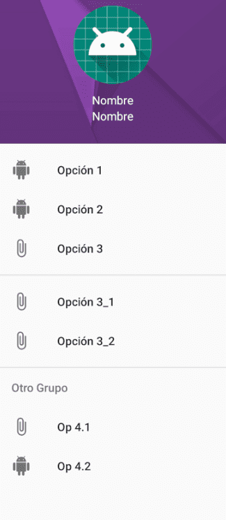
</androidx.drawerlayout.widget.DrawerLayout>As you can see, our side menu consists of two parts, the first of which is the DrawerLayout is nothing more than a container and not only this, it is the Top of the containers, which means that it cannot be contained by any other element but must be at the top of our view; here is what is the content of our view such as buttons, images and of course our side menu, which is defined by theNavigationView.
So in summary, we have a container called Drawer Layout and a menu that is contained within it with Navigation View.
Side menu properties
If we analyze the previous code, you will see that there are some important properties; among them is android:fitsSystemWindows set to true; this property allows the sliding of our side menu to be carried out correctly and not to conflict with any other system component such as the status bar.
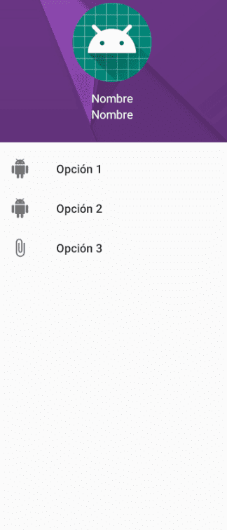
Also in our Navigation View we are defining a menu, or rather, a reference to our menu, which looks like this:
<?xml version="1.0" encoding="utf-8"?>
<menu xmlns:android="http://schemas.android.com/apk/res/android">
    <item android:title="Option 1"
          android:icon="@drawable/ic_android"
          android:id="@+id/op1"></item>
    <item android:title="Option 2"
          android:icon="@drawable/ic_android"
          android:id="@+id/op2"></item>
    <item android:title="Option 3"
          android:icon="@drawable/ic_attach_file"
          android:id="@+id/op3"></item>
</menu>
As you can see, the menus define a property to indicate the title or name of our menu option android:title and also specify an icon android:icon.
Define a header
And we also define the app:headerLayout property, which is optional and allows us to indicate another layout with the content of our header; here, being another layout, we can design whatever we want, although it is usually styled for something simple, like an image of the person's avatar and an identifier for it, their name, generally; in our case, we will use the following XML:
<?xml version="1.0" encoding="utf-8"?>
<LinearLayout xmlns:android="http://schemas.android.com/apk/res/android"
              android:layout_width="match_parent"
              android:layout_height="200dp"
              android:orientation="vertical"
              android:background="@drawable/nav_drawer_header"
              android:padding="16dp">
    <ImageView
            android:src="@mipmap/ic_launcher"
            android:layout_width="96dp"
            android:layout_gravity="center"
            android:layout_marginBottom="10dp"
            android:layout_marginTop="15dp"
            android:layout_height="96dp"/>
    <TextView android:layout_width="match_parent"
              android:layout_height="wrap_content"
              android:textColor="#FFF"
              android:gravity="center"
              android:text="Name"/>
    <TextView android:layout_width="match_parent"
              android:layout_height="wrap_content"
              android:textColor="#FFF"
              android:gravity="center"
              android:text="Name"/>
</LinearLayout>
Which is displayed as:

The rest of the properties are easy to understand, they are already common in Android; for example to define the width, height, position, etc.
With this we already have a side menu like the following:
Quite easy actually, but we can still modify a few more things.
Groups in our side menu items
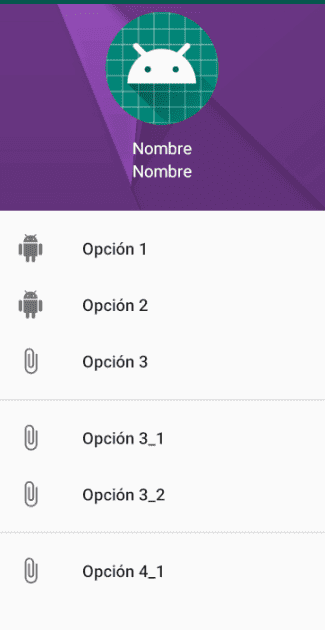
Groupings are very useful when we want to have options of the same theme or category in the same row; although at a visual level a great distinction is not achieved (just a separation line), we can group this section and hide or show it on demand programmatically from Java or Kotlin code:
    <group android:id="@+id/group1">
        <item android:title="Option 3_1"
              android:icon="@drawable/ic_attach_file"
              android:id="@+id/op3_1"></item>
        <item android:title="Option 3_2"
              android:icon="@drawable/ic_attach_file"
              android:id="@+id/op3_2"></item>
    </group>
With this XML we have the following presentation in our NavigationDrawer:
Define an option as clickable + group title
We can indicate that only one option is selectable at a given time with checkableBehavior indicated with the value single and we can also indicate a title for our grouping as follows:
<?xml version="1.0" encoding="utf-8"?>
<menu xmlns:android="http://schemas.android.com/apk/res/android">
    <item android:title="Option 1"
          android:icon="@drawable/ic_android"
          android:id="@+id/op1"></item>
    <item android:title="Option 2"
          android:icon="@drawable/ic_android"
          android:id="@+id/op2"></item>
    <item android:title="Option 3"
          android:icon="@drawable/ic_attach_file"
          android:id="@+id/op3"></item>
    <group android:id="@+id/group1">
        <item android:title="Option 3_1"
              android:icon="@drawable/ic_attach_file"
              android:id="@+id/op3_1"></item>
        <item android:title="Option 3_2"
              android:icon="@drawable/ic_attach_file"
              android:id="@+id/op3_2"></item>
    </group>
    <group android:id="@+id/group2"> android:checkableBehavior="single"
        <item
                android:id="@+id/navigation_subheader"
                android:title="Another Group">
            <menu>
                <item
                        android:id="@+id/menu_opcion_1"
                        android:icon="@drawable/ic_attach_file"
                        android:title="Op 4.1"/>
                <item
                        android:id="@+id/menu_opcion_2"
                        android:icon="@drawable/ic_android"
                        android:title="Op 4.2"/>
            </menu>
        </item>
    </group>
</menu>
With this, we get:
Creating the NavigationDrawer with ListViews (Legacy Approach)
This section describes the implementation of a side menu using ListView, which represents an older approach. For new applications, it is strongly recommended to use RecyclerView for greater flexibility and performance. In this first entry we will see how to create a basic side menu in Android:
- Creating a Drawer Layout.
- Referencing the Drawer Layout and the Navigation Drawer.
- Defining the Adapter with the options structure.
- Configuring the open and close events of the side menu with the application icon.
1. Creating the Drawer Layout
The first thing we must do is modify the layout structure of the activity in which we want the side menu to be displayed, we add the DrawerLayout as the root element of the main layout of the activity, in addition to a ListView for the side menu (Navigation Drawer). If this was the layout with the main content to display:
<RelativeLayout xmlns:android="http://schemas.android.com/apk/res/android"
    xmlns:tools="http://schemas.android.com/tools"
    android:layout_width="match_parent"
    android:layout_height="match_parent"
    tools:context=".MainActivity" >
	<TextView
	    android:id="@+id/textView1"
	    android:layout_width="wrap_content"
	    android:layout_height="wrap_content"
	    android:text="Hello World!" />
</RelativeLayout/>
By adding the DrawerLayout and the ListView in the activity's layout, it would look like this:
<androidx.drawerlayout.widget.DrawerLayout xmlns:android="http://schemas.android.com/apk/res/android"
    android:id="@+id/drawer_layout"
    android:layout_width="match_parent"
    android:layout_height="match_parent" >
    <RelativeLayout
        xmlns:tools="http://schemas.android.com/tools"
        android:layout_width="match_parent"
        android:layout_height="match_parent"
        tools:context=".MainActivity" >
        <TextView
            android:id="@+id/textView1"
            android:layout_width="wrap_content"
            android:layout_height="wrap_content"
            android:text="Hello World!" />
    </RelativeLayout>
    <ListView
        android:id="@+id/list_view"
        android:layout_width="300dp"
        android:layout_height="match_parent"
        android:layout_gravity="start"
        android:background="#007095"
        android:choiceMode="singleChoice"
        android:divider="#005875"
        android:dividerHeight="2dp" />
</androidx.drawerlayout.widget.DrawerLayout>
</RelativeLayout/>
You have to place the content of the activity inside (as a child element) of the androidx.drawerlayout.widget.DrawerLayout.
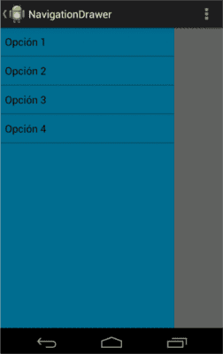
It is possible to specify the direction where you want to display the menu using the layout_gravity property:
layout_gravity="left":
layout_gravity="right":
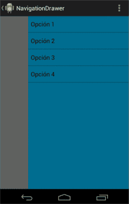
It is customary for the location of the side menu to be on the right.
2. Referencing the Drawer Layout and the Navigation Drawer
Once the layout of the activity is defined, the next step is to reference the elements with which we are going to work; the ListView (Navigation Drawer: where our panel or side menu will be rendered):
ListView listView = (ListView) findViewById(R.id.list_view);And the DrawerLayout, which represents the container that allows the creation of interactive Drawer-type views:
DrawerLayout drawerLayout = (DrawerLayout) findViewById(R.id.drawer_layout);3. Defining the Adapter with the options structure
Once the elements to be used in the Activity are referenced, it is now possible to create the options menu from an options structure such as a List or Array and establish them in the ListView (Navigation Drawer) through an Adapter:
String[] options = { "Option 1", "Option 2", "Option 3", "Option 4" };
listView.setAdapter(new ArrayAdapter<String>(this,
		android.R.layout.simple_list_item_1, android.R.id.text1,
		options));
It is possible to create a custom Adapter to add other elements to the menu such as icons, this will be explained in other installments.
4. Configuring the open and close events of the side menu with the application icon
We must override and implement the following events and functions if we want to:
- Customize the events when pressing each option:
Show or hide the panel or side menu: 	// We show the button on the application bar
	//getActionBar().setDisplayHomeAsUpEnabled(true);
	@Override
	public boolean onOptionsItemSelected(MenuItem item) {
		switch (item.getItemId()) {
		case android.R.id.home:
			if (drawerLayout.isDrawerOpen(listView)) {
				drawerLayout.closeDrawers();
			} else {
				drawerLayout.openDrawer(listView);
			}
			return true;
		}
		return super.onOptionsItemSelected(item);
	}
Next step, learn how to create your tab system in Jetpack Compose with HorizontalPager.