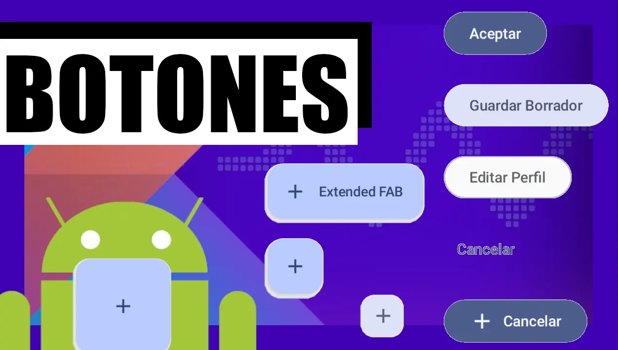
Content Index
- Floating Action Button with Jetpack Compose (The Modern Approach)
- What is a Floating Action Button?
- Types of Floating Buttons
- FAB Implementation in Compose
- Customization with Shape
- Using it in activities along with the Scaffold
- Floating Action Button with XML (Legacy Approach)
- Incorporating dependencies in Gradle
- Instantiating the floating button in XML
- Using the FloatingActionButton from the Activity or Fragment
- Animations on the Floating Action Button
- Positioning on the edge of containers
- Converting the Floating Action Button into a Toolbar (Obsolete Pattern)
The Floating Action Button (FAB) is a key component in user interface design for Android applications. It is used to represent the main or most common action on a screen. In this post, we will explore how to implement this button with both the modern Jetpack Compose and the traditional XML-based Legacy View System.
We agreed that we learned how to use Buttons in Android Studio: FilledTonalButton, OutlinedButton, TextButton, Column Click Icons
Floating Action Button with Jetpack Compose (The Modern Approach)
Jetpack Compose is the modern toolkit recommended by Google for building native user interfaces in Android. Its declarative nature greatly simplifies UI development.
What is a Floating Action Button?
Basically, it's a type of button, but a bit "richer" than previous ones.
We can change the size, add text (in the case of the extended button), and of course, it always has an icon. As always, it also has its onClick event.
Types of Floating Buttons
Using these buttons is very simple; they are more visually "rich" than standard buttons and allow you to vary their size or add text:
- SmallFloatingActionButton: A small version.
- LargeFloatingActionButton: To highlight the action more.
- ExtendedFloatingActionButton: Allows including an icon and a text label.
- FloatingActionButton: The default size.
FAB Implementation in Compose
Just like before, it's just a button, and let's see some variations in the following example:
import androidx.compose.foundation.shape.CircleShape
import androidx.compose.foundation.shape.CutCornerShape
import androidx.compose.foundation.shape.RoundedCornerShape
import androidx.compose.material.icons.Icons
import androidx.compose.material.icons.filled.Add
import androidx.compose.material3.ButtonDefaults
import androidx.compose.material3.ExtendedFloatingActionButton
import androidx.compose.material3.FloatingActionButton
import androidx.compose.material3.LargeFloatingActionButton
import androidx.compose.material3.MaterialTheme
import androidx.compose.material3.SmallFloatingActionButton
***
@Composable
fun ExamplesFAB() {
    Column(
        modifier = Modifier.fillMaxWidth().padding(16.dp),
        verticalArrangement = Arrangement.spacedBy(20.dp)
    ) {
        // 1. FAB SMALL
        SmallFloatingActionButton(
            onClick = { },
            containerColor = MaterialTheme.colorScheme.secondaryContainer,
            contentColor = MaterialTheme.colorScheme.secondary
        ) {
            Icon(Icons.Filled.Add, "Small floating action button.")
        }
        // 2. FAB Large
        LargeFloatingActionButton(
            onClick = { },
//            shape = CutCornerShape(1.dp)
//            shape = RectangleShape
            shape = RoundedCornerShape(15.dp)
//            shape = CircleShape,
        ) {
            Icon(Icons.Filled.Add, "Large floating action button")
        }
        // 3. FAB + TEXT
        ExtendedFloatingActionButton(
            onClick = { },
            icon = { Icon(Icons.Filled.Add, "Extended floating action button.") },
            text = { Text(text = "Extended FAB") },
        )
        // 4. FAB
        FloatingActionButton(
            onClick = {  },
        ) {
            Icon(Icons.Filled.Add, "Floating action button.")
        }
    }
}
@Preview(showBackground = true)
@Composable
fun GreetingPreview() {
    MyProyectAndroidTheme {
       // Greeting("Andasasasroid")
        ExamplesButtons()
        //ExamplesFAB()
    }
}
Customization with Shape
Something interesting is the shape property, which defines the button's shape.
All buttons share these properties; I have applied some and not others, just to show visual differences.
For example:
- CutCornerShape: cut corners
- RoundedCornerShape: rounded corners
Here it is necessary to import the corresponding class and define the size, for example 12.dp.
The effect is very similar to what would be a border-radius in web development.
Using it in activities along with the Scaffold
In Compose, the FloatingActionButton is typically integrated within a Scaffold, which provides a standard Material Design structure for your screen.
@Composable
fun FabExampleScreen() {
    Scaffold(
        floatingActionButton = {
            FloatingActionButton(
                onClick = {
                    // Action when clicking the FAB
                    println("FAB pressed!")
                }
            ) {
                Icon(
                    imageVector = Icons.Default.Add,
                    contentDescription = "Add"
                )
            }
        },
        floatingActionButtonPosition = FabPosition.End
    ) { innerPadding ->
        // Your screen content
        Box(
            modifier = Modifier
                .padding(innerPadding)
                .fillMaxSize(),
            contentAlignment = Alignment.Center
        ) {
            Text("Screen content")
        }
    }
}
In this example:
Scaffoldorganizes the screen and gives us a dedicated space for the FAB (floatingActionButton).FloatingActionButtonis the composable that creates the button. ItsonClicklambda defines the action to be executed.Iconis used to display an icon inside the FAB, using the predefined Material icons (Icons.Default.Add).
As you can see, the code is concise, declarative, and much more intuitive than the XML-based approach.
Floating Action Button with XML (Legacy Approach)
Although Jetpack Compose is the future, many existing applications still use the XML-based view system. Below, we detail how to work with the FAB in this environment, updated to modern practices.
Incorporating dependencies in Gradle
To use Material Design components in the view system, you must add the Material Components for Android library to your build.gradle.kts (or build.gradle) file:
// In build.gradle.kts (Groovy: implementation 'com.google.android.material:material:1.12.0')
implementation("com.google.android.material:material:1.12.0")
Note that compile is obsolete; implementation is now used. Once modified, Android Studio will sync to download the library.
Instantiating the floating button in XML
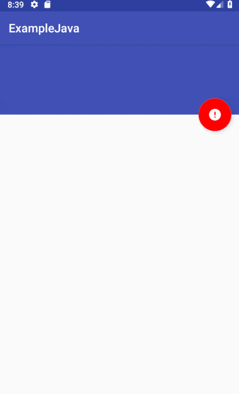
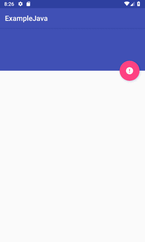
With the dependency configured, you can add the FloatingActionButton to your XML layout. The correct class to use is com.google.android.material.floatingactionbutton.FloatingActionButton.
<androidx.coordinatorlayout.widget.CoordinatorLayout
    xmlns:android="http://schemas.android.com/apk/res/android"
    xmlns:app="http://schemas.android.com/apk/res-auto"
    android:layout_width="match_parent"
    android:layout_height="match_parent">
    <!-- Your screen content -->
    <com.google.android.material.floatingactionbutton.FloatingActionButton
        android:id="@+id/my_fab"
        android:layout_width="wrap_content"
        android:layout_height="wrap_content"
        android:layout_gravity="bottom|end"
        android:layout_margin="16dp"
        app:srcCompat="@drawable/ic_add"
        android:contentDescription="Add" />
</androidx.coordinatorlayout.widget.CoordinatorLayout>
Some key points:
- It is recommended to use a
CoordinatorLayoutas the root container to allow the FAB to interact correctly with other components like aSnackbar. app:srcCompatis used instead ofandroid:srcfor better vector compatibility.- You can easily generate icons in Android Studio: right-click on
res/drawable→ New → Vector Asset.
Other important attributes are app:fabSize (normal or mini) and app:backgroundTint for the background color.
Using the FloatingActionButton from the Activity or Fragment
To interact with the FAB from your Kotlin or Java code, the modern and safe way is to use View Binding.
First, enable it in your build.gradle.kts file:
android {
    // ...
    buildFeatures {
        viewBinding = true
    }
}
Then, in your activity, you can access the button safely:
// Binding variable declaration
private lateinit var binding: ActivityMainBinding
override fun onCreate(savedInstanceState: Bundle?) {
    super.onCreate(savedInstanceState)
    // Inflate and set the layout
    binding = ActivityMainBinding.inflate(layoutInflater)
    setContentView(binding.root)
    // Access the FAB through binding
    binding.myFab.setOnClickListener { view ->
        Snackbar.make(view, "You touched the FAB", Snackbar.LENGTH_LONG).show()
    }
}
This approach eliminates the need for findViewById, avoiding null pointer and type casting errors.
Animations on the Floating Action Button
Animations are still an important part of the user experience. You can animate the FAB in the same way as other views, for example, to scale it on click.
val interpolator = AnimationUtils.loadInterpolator(baseContext,
       android.R.interpolator.fast_out_slow_in)
binding.myFab.setOnClickListener { view ->
   view.animate()
       .scaleX(0f)
       .scaleY(0f)
       .setInterpolator(interpolator)
       .setDuration(300)
       .withEndAction {
           view.animate()
               .scaleY(1f)
               .scaleX(1f)
               .setInterpolator(interpolator)
               .setDuration(300)
               .start()
       }
       .start()
   Snackbar.make(view, "You touched the FAB", Snackbar.LENGTH_LONG).show()
}
This Kotlin code is cleaner and uses withEndAction to chain the animation back to its original state.
Positioning on the edge of containers
A powerful feature of CoordinatorLayout is the ability to "anchor" a FAB to another component. This is useful for creating complex layouts where the FAB is positioned in relation to, for example, an AppBarLayout.
<com.google.android.material.floatingactionbutton.FloatingActionButton
    android:id="@+id/my_fab"
    android:layout_width="wrap_content"
    android:layout_height="wrap_content"
    app:layout_anchor="@id/app_bar"
    app:layout_anchorGravity="bottom|end"
    android:layout_margin="16dp"
    app:srcCompat="@drawable/ic_add" />
In this example, app:layout_anchor links the FAB to the AppBarLayout with the id app_bar, and app:layout_anchorGravity defines how it aligns with respect to that anchor.
Converting the Floating Action Button into a Toolbar (Obsolete Pattern)
In the past, there were third-party libraries to transform a FAB into a floating toolbar. An example was com.github.rubensousa.floatingtoolbar.FloatingToolbar.
Warning: This pattern and the associated libraries (like the one mentioned) are no longer maintained and are considered obsolete. The Android community has evolved towards other UI patterns, such as contextual menus or bottom sheets. It is discouraged to implement this functionality in the way described in old versions of this article. The code is kept for historical reference only.